The logo that lost a dot
Originally published on LinkedIn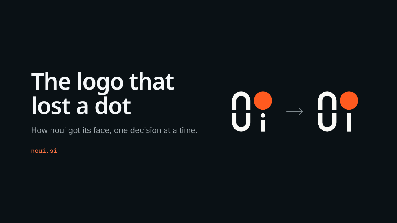
noui logo came together over one evening, and it ended with one missing dot.
noui is built around a simple question: what if software stopped making you learn its interface? Instead of fixed screens, it shapes itself around what you need.
Every product needs a face at some point. This is how noui got its own: the rules I set, the idea that made it, and the decisions in between. The new logo is now live on noui.si, page-loading animation and all.
Three rules before drawing anything
Before any sketches, I wrote down three rules:
-
Use all four letters of “noui”. No abstract symbol people have to learn first.
-
One or two colors, nothing more.
-
It must still work as a tiny browser tab icon, 16 pixels wide.
The third rule ended up shaping almost everything else.
At 16 pixels, nobody reads letters
The first round gave me three directions, side by side:
-
Grid: “no” on top and “ui” below, inside a small square, with a ring for the o.
-
Glyph: the same square, but the o becomes a solid orange disc.
-
Condensed: the whole word on one line, in tall, narrow letters.
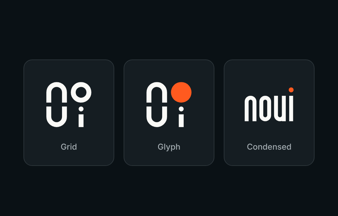
Condensed read the most like the name at a large size. It was also the first to go. Shrunk down to a browser tab, the gaps inside its letters were barely a pixel wide.
That was the first real lesson. At small sizes, people don’t read four letters. They recognize a shape. A stacked square gives the eye one clear shape to remember.
The dot that didn’t need to exist
The moment that made the logo came while looking at the stacked version.
The o sat directly above the i. Which raised a simple question: why does the i need its own dot? The o could be the dot.
Removing it did more than I expected. The mark got simpler. Once the i’s stem grew to the height of the u, the bottom row finally looked balanced. And the orange disc became the only color moment in the whole logo.
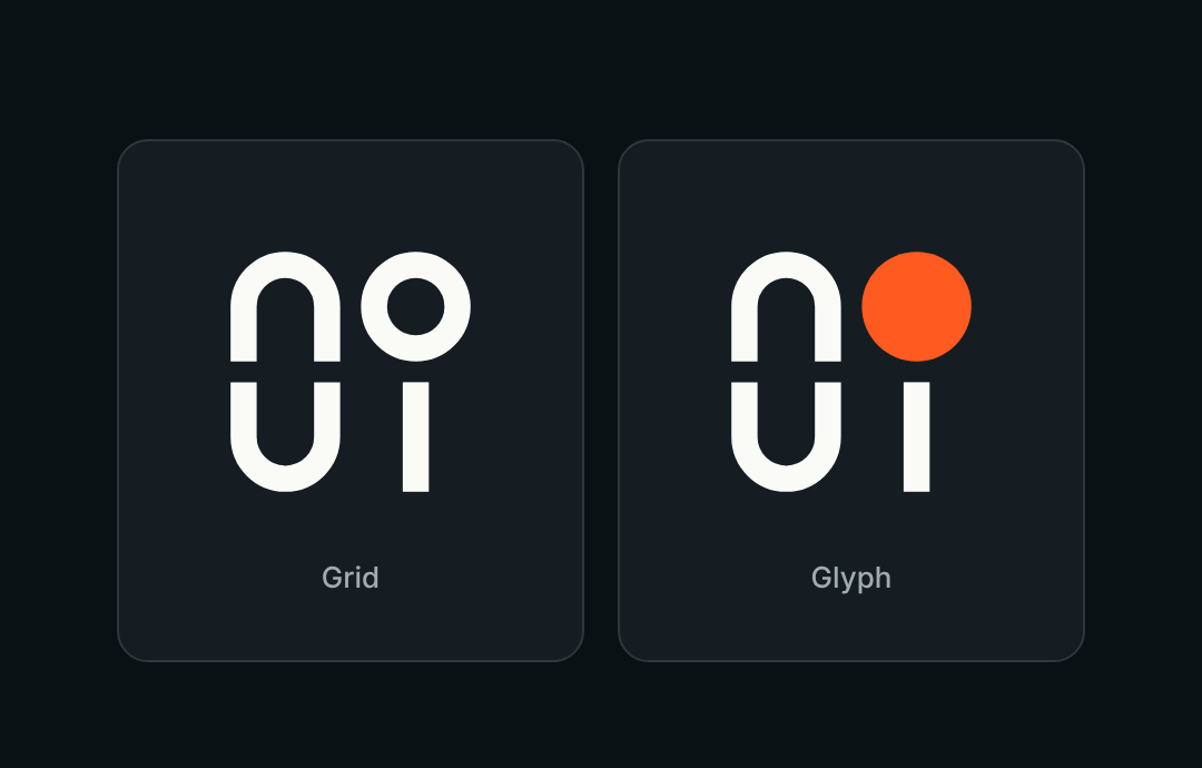
It worked better with the solid disc than with the ring. A disc on a stem reads like an oversized i. A ring on a stem starts to look like a pin.
There is one honest risk. Without its dot, the i could be read as an l. That’s something to test with real people, not settle by opinion.
Making it move
I wanted the logo to animate for loading screens, app launches and video intros. The question was how.
The answer had to come from the product. noui is about interfaces reshaping themselves, so every idea started there:
-
Familiar controls, like a spinner, a radio button, a dropdown arrow and a text cursor, turn into the four letters.
-
A dashboard layout rearranges itself into the logo.
-
“noui” is typed like a prompt, then each letter lifts into its place.
-
The letters draw themselves, stroke by stroke.
-
The i’s dot rises and becomes the o.
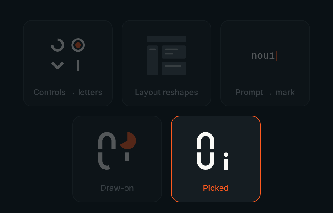
Each one became a playable prototype, and I watched them side by side. The last one won easily. It’s short, it holds up at small sizes, and it’s the only one that couldn’t belong to anyone else’s logo. It tells the exact story of the dot.
Then I added my own twist. Before the dot rises, the i’s stem squashes down like a spring, then bounces back and flings its dot up. The dot stretches as it flies, turns orange, and grows into the o. The whole thing takes 1.4 seconds.
As a loader, it plays back and forth. The dot drops back onto the stem, then gets flung up again.

From a picture to a product
A logo isn’t finished when it looks right. It’s finished when it works everywhere it has to live.
A few decisions only showed up once I put it in real places:
-
Dark mode. The dark tile behind the logo nearly disappears on noui.si’s dark background. So on dark screens, the mark appears without its tile.
-
Orange stays rare. Orange became the brand color, but only for what matters: the main action, focus, progress and the logo itself. White text on our orange also failed contrast checks, so buttons use dark text instead.
-
Fonts. Noto Sans for headlines, Inter for everything else.
-
One motion, everywhere. The animation comes from a single timeline. That one source produces the website loader, the files for the iOS and Android apps, and the videos, so they always match.
All of it went into one brand kit, and the logo with its page-loading animation went live on noui.si the same day.
Working with Claude
I did all of this in one long conversation with Claude, so it’s worth being specific about its role.
It was great at three things. Turning a half-formed idea into several options within minutes. Building things I could actually try, like playable animations instead of descriptions of them. And pushing back.
Some of the most useful moments were a “no”. The narrow version won’t survive at 16 pixels. Don’t A/B test a favicon on a live website, because the effect is too small to measure. The dark tile will vanish on your own site.
The decisions stayed with me: the rules, dropping the dot, picking the dot animation, the spring, the fonts. Each one came from looking at options and asking one question: does this feel like noui?
The tool made exploring cheap. The taste still had to come from me.
At this point, I honestly don’t know if I’m a coder or a designer.
What I’d tell another founder
-
Write your constraints first. Three rules did more for this logo than any amount of inspiration.
-
Design for the smallest size. If it works as a 16-pixel icon, it will work everywhere else.
-
React, don’t just prompt. The best idea came from looking at options, not from describing what I wanted.
-
Ask for pushback. A tool that agrees with everything isn’t helping you decide.
-
Let the product shape the brand. The animation works because it tells the same story as noui.
-
Finish the job. A logo that only exists as a picture isn’t done. Ship it to every place it will live.
One thing removed
Funny how a logo for a product about “no UI” ended up being about removing one more thing: a dot.
If you’re wondering how to say it: “no-you-eye”, exactly like “no UI”. The name is the idea.
You can see the logo and its animation live at noui.si.